With so many choices available for multi-sectional manufactured homes, it’s important for builders to make their double wide home design stand out. Clayton Homes is doing that with their Stockton model.
The Stockton from Clayton Homes has an oddly vintage look to it while still showcasing modern popular trends. Wood is a major theme in this home. It has tons of wood paneling and wood accents in a deep chestnut brown that reminds me of my father’s 1986 model double wide wood trim.
Clayton was going for a traditional farmhouse or ranch look and they nailed it but maybe they nailed it a little too much?
The Stockton’s Stats
From 2,077 Square Feet with 4 Beds, 2 Baths
Priced from $92,800 (without land)
Marriage Line Divorce?
When purchasing a new manufactured home one of the most important things you will need to consider is which floor plan will fit your needs best. The Stockton would be a good choice if you are looking for a completely open floor plan.
Read more about manufactured home floor plans here.
 Marriage Line Divorce
It’s pretty rare to have such a open space in a double wide. Readers often ask us how to open up a marriage line but we don’t recommend marriage line modifications at all because there is always an issue down the road regardless of how well it was done. For those that want an open floor plan with minimal marriage line wall, this double wide home design is a great choice.
The reason the home has such an open floor plan is the absence of a marriage wall. If you’ve read any of our previous articles about manufactured home construction, you’ll know that the marriage line is a load-bearing wall for both sections of a double wide – in other words, it’s pretty important.
Busy Kitchen
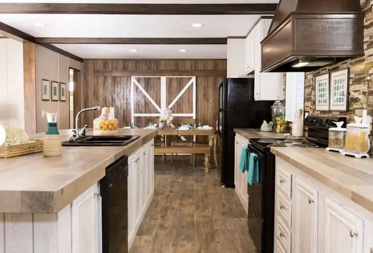
The kitchen in The Stockton plan offers a lot of sought-after elements. The breakfast counter is one of the largest we’ve seen in a recent double wide home design.
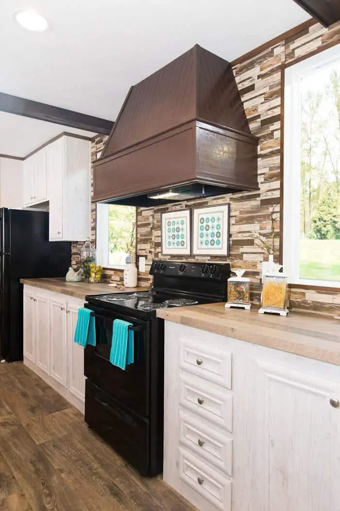
Dark appliances, distressed white cabinetry, ‘bronze’ range hoods, wooden ceiling beams, and butcherblock countertops are all popular trends in kitchen design. But should they all be one place?

The images shown include all the upgrades the builder offers: dishwasher, windows on both sides of the stove, and the fancy range hood.
But why is a dishwasher considered an upgrade?
It’s 2018 and we think dishwashers should be a standard feature. It looks like you can choose which side of the sink you want the dishwasher on so I guess that’s why it’s an ‘upgrade’ option?

Why is a dishwasher an upgrade in a 2018 model home? Am I missing something here?
The kitchen is busy with lots of different woods and materials and direction. I think if they’d change the faux backsplash that looks like a hybrid between ceramic tile and shiplap to a less busy design it would look a lot better with the faux butcherblock counters. What do you think?

A trendy sliding barn door hides additional storage space in the dining area.
Living Room and Family Room/Den
This is the den or family room beside the kitchen. Here’s a good look at the walls. They’ve continued the kitchen’s materials and paired whitewashed beadboard with wood paneling. It’s a lot to take in but works well for people that appreciate the traditional home decor.

The living room walls are light colored VOG panels with matching strips. The dark ceiling trim matches the rest of the home. Beige carpet gives the space a nice grounding.

Master Bedroom and Bathroom
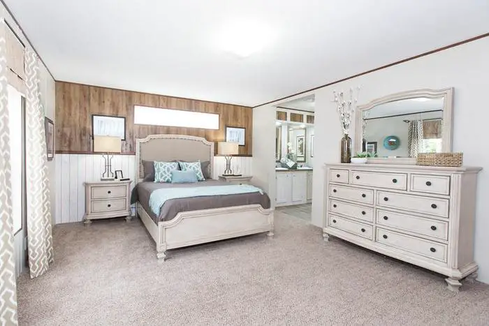
The master suite offers a transom window upgrade above the bed and I definitely would pay extra for that.
Transom style windows allow a ton of light into the room without losing wall space or privacy. Transom windows offer a nice contrast to the exterior of a home as well. I haven’t met a transom window I didn’t like!

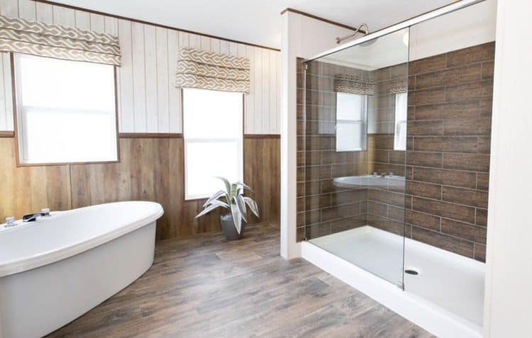
The master bathroom is a true throwback to the late 1970s mobile home design. The boxed lighting above the sinks is exactly how our 1978 bathroom was done!
Clayton has reversed the paneling style in the bathroom. The white paneling is on top of the wood paneling. The wood flooring and the wood paneling is a lot of lines and texture for one space. Fortunately, the whitewashed cabinetry breaks up the space a bit.


The walk-in shower is a great size but in this image alone we have 3 different kinds of wood and 3 different types of white. In one space.
Ok. I’m done. I can’t do this anymore. It’s time to be honest…..
This Double Wide Home Design is a Hot Mess
I’ve tried to be nice and only highlight the good but this double wide home design is a hot mess, y’all.
I’ve always tried to be positive here on Mobile Home Living because mobile homes and those living in them suffer enough negativity but I have to break protocol on this one. The Stockton model by Clayton Homes is a mess of materials and lines and textures and surfaces. The floor plan is great, though.
What do you think? Am I being too harsh? Let me know in the comment section below!
As always, thank you for reading Mobile Home Living!
Note: we are not affiliated with Clayton Homes or any builders or any dealers of any brand. All opinions are our own.

For the life of me I can’t understand why mobile home companies are not designing a mid century modern line of affordable single and double wides. I.E. beamed, tongue & groove look ceilings, large windows and sliders, transomes in the bedrooms, ikea simple slab cabinetry, floating bathroom vanity’s, etc. I gave up after touring several companies wares; the hideous design (and no, they won’t sell you a shell you can work with) and the chemical off gassing gave me a migraine. So, I bought a hell hole 80s double wide at a “country club”-lol- in Desert Hot Springs with high sloped ceilings and beams and am in the process of of “mid century modernizing it.”
Hi Heath!
Congratulations on your new home! I wish they would start thinking outside the box a bit more, too! Unfortunately, when they do create something cool no one buys it (the ihome from Clayton is a good example). Manufactured home buyers are pretty predictable – they like traditional and farmhouse. Ironically, I’m in the process of writing an article about the off-gassing and toxic chemicals in new homes (hope you felt better quickly). Please take lots of pics and notes so I can feature you and your home when you’re finished!
Thanks for reading and best of luck!
Wow, this is definitely one of the more interesting designs out there! Clayton must be cleaning out some of their old materials from the warehouse, it’s so “busy” , it certainly would be hard to decorate. That said, I really really like the openness of this design. Take care.
Ha! That’s probably exactly what they are doing! Good catch!
I have to agree with you – I don’t like this home. It is too busy and looks cheap.
I thought it was just me! I do not like the wood paneling at all. I agree there is just too much going on with this house. It’s like they tried to put every trend out there into one space.
Keep up the great work. I just love your articles and practical information. Finally this housing industry is receiving the attention it deserves.
Thanks, Stephen!
I agree with you…way too much going on…hurts my eyes…not relaxing to me. That said, outside of the materials, I love the open floor plan.
Glad I’m not the only one! Thanks, Perri!
Crystal, I agree about it being a hot mess. I too love the floor plan but I also like simplicity in design…too many textures and products
It’s crazy how many textures and designs are in one room! Thanks for commenting, Carla!
I hate the wood paneled walls!
I also don’t like the dark beams on the ceiling.
You are correct!
The floor plan appeals to me.
HOWEVER
The interior design is abysmal. Choppy, overpowering and cheap.
You describe it perfectly, Margaret! Thanks for commenting!
I think “hot mess” is an understatement. I really cannot believe someone paid a photographer to take pictures of that home. It is as if someone took all of the popular (not necessarily “good”) home trends for the last 40 years and put them in one spot. Yikes! I recently purchased a Champion home and the dishwasher was an upgrade. I know, right?! So, we just had the builder leave the cabinet out and bought our own dishwasher.
LOL! You made me giggle, Richard! Smart move on the dishwasher! I think it’s a good move to do that with the faucets (just get the ol’cheapos and replace them yourself). Thanks for the comment!
I’m with you. Too many conflicting finishes!! I have said for some time…..who do they hire as their designers? I truly believe they could sell many more homes (at no additional cost to them) if they had designers that picked finishes that actually go with each other.
For so long they only offered really dark cabinets, etc. At least finally you can get lighter cabinets, but why so many conflicting finishes? I had to custom order my home to avoid this. I could pick out my own finishes and avoid this fiasco.
The industry does so many things that I question. I really do want to get them all in a room and just scream at them for about a solid hour…lol. Thanks for commenting!
i agree. what a mess! Though I like the open concept and the kitchen.
I sure hope the designers at Clayton is reading this! Thanks for the comment, Patricia!